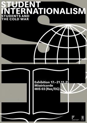
Student Internationalism
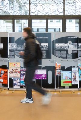
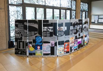
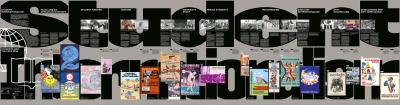
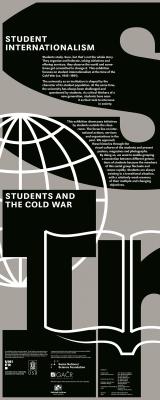
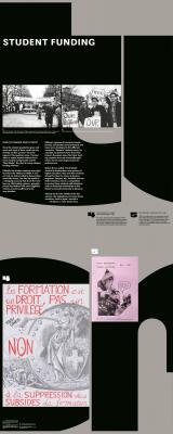
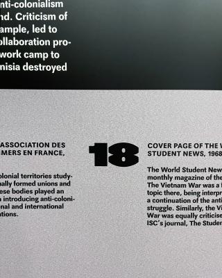
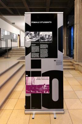
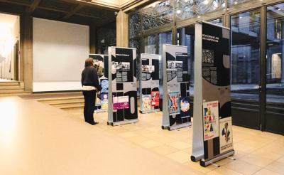
A travelling exhibition on the rich visual history of student unions in the post-war period. This required an investigation into the significance of visual symbols at the time. The design is inspired by bulletin boards and university walls, where information overlaps. The large typeface HAL Gap refers to the brutalist architecture of the time, while the smaller typeface Maxima by Gert Wunderlich reflects the tension and connection between Eastern and Western graphic design. The exhibition builds a bridge between academic research and interested viewers, as well as between former and current students.
- Medium Exhibtion
- Service Design
- Client Uni Fribourg, Czech Academy of Science AVČR
- Industry Education, Research
- Year 2025