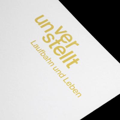
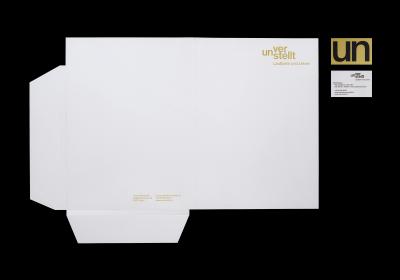
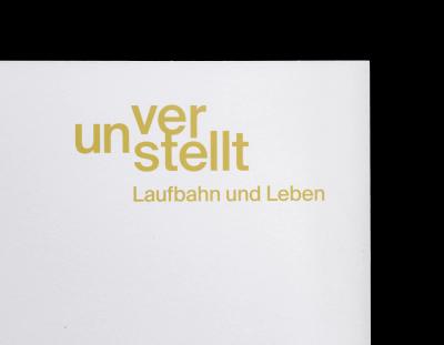
unverstellt

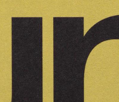
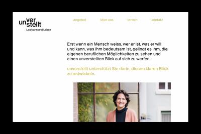
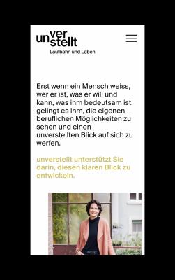
At first a weakness, the "un-" prefix became the recognizable mark for career and life coach Nicole Seiler. In her consultancy, language is her main tool, so we built a system out of it and applied it across her logo and website. Paired with a rich kiwi gold colour and a calm layout, it creates a warm but professional environment in which clients feel comfortable.

Logo design with modular typography, restrained green-yellow color accents, and minimal layouts applied to folder and business card.Swiss design brand stationery with modular typography, restrained green-yellow color accents, and minimal layouts applied to folder and business card.Brand identity with classic helvetica neue typography, restrained green-yellow color accents, and minimal layouts applied to folder and business card.Detail view of a brand identity with modular typography, restrained green-yellow color accents, and minimal layouts applied to folder and business card.Business card detail with visible 4-color halftone grid of black typography on green-yellow background.Playfull business card which is readable from both sides, thanks to small cap helvetica neue letters «u» and «n».Website in reduced typographical swiss graphic design style kept in black white and yellow creating a warm and professional visual identity.Mobile Website in reduced typographical swiss graphic design style kept in black white and yellow creating a warm and professional visual identity.
  • Medium Logo, Corporate Design, Website
  • Service Design, Code
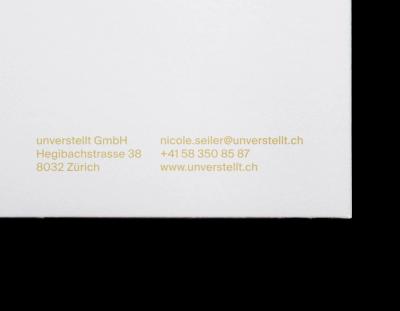
  • Client unverstellt GmbH
  • Team Photography by Valentina Verdesca
  • Industry Coaching, Consulting
  • Year 2025
  • Website www.unverstellt.ch